MAZE21
©2013 Craig Ashby
7.75” x 9.375”
Collage
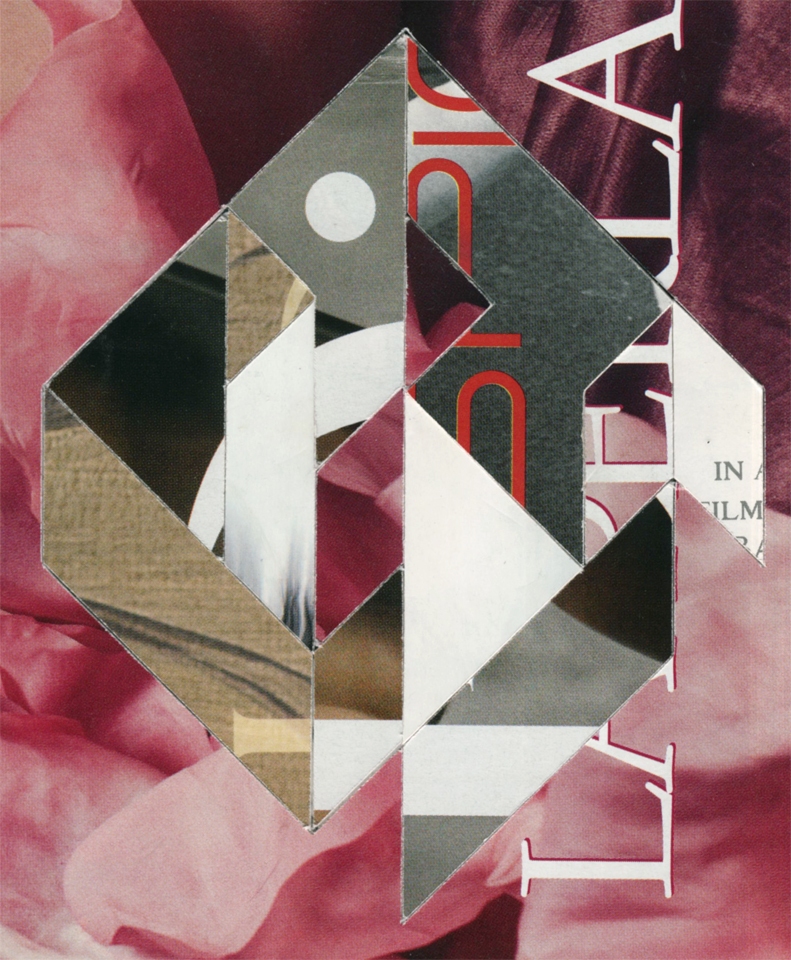
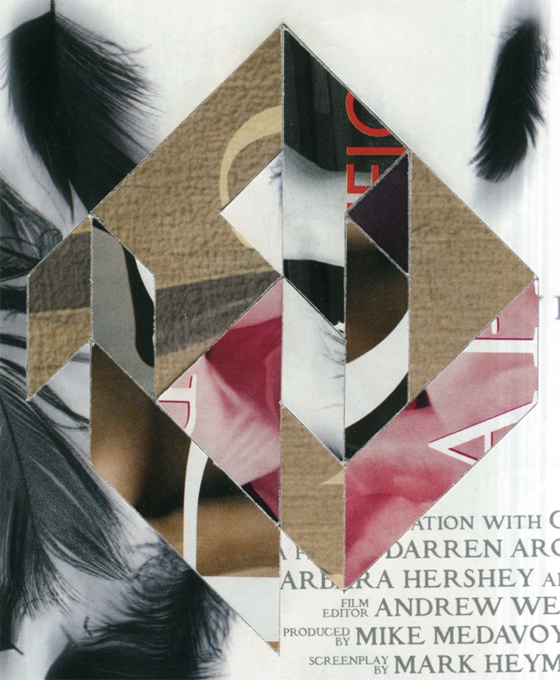
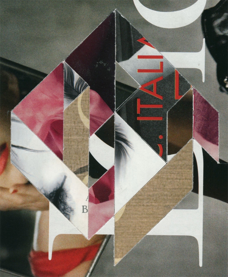
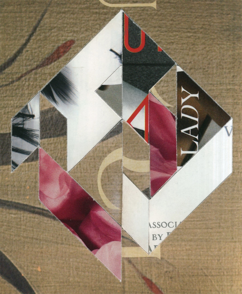
With the next ten, and specifically with MAZE21, I reintroduce text intentionally back into the MAZE Series. La Perla, Dior, Gucci and The Black Swan all feature text heavy elements.
The color combination is wonderful. The Dior i dot in MAZE21-1 held perfectly in the triangle reads as a minimal fish or bird. Bird is a fun association because lately I have notice how tree and flower-like the imagery is. The floral imagery in the La Perla advertisement really reinforces this idea.
The entire series has grown on me tremendously through the process. I honestly never thought I would finish all forty pieces. After the first ten I thought of truncating the series. The lack of response also made me question if I should stop.
I didn’t and I think I do achieve a lot in the second half. This piece being a good place to start. It plays to my strengths. Cut up text is a great sigil and something that works nicely for me.
Hershey, Andrew, Mike, Mark. And the super visible Lady. It’s all speaking properly and I love this particular MAZE. It’s one of the best in the series and it proves that persistence is essential.


