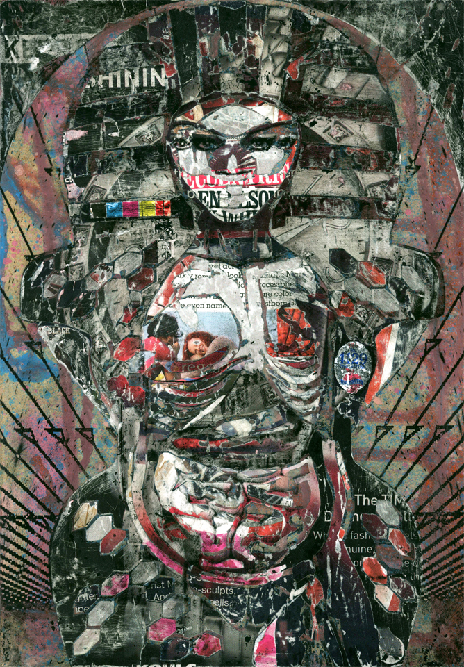
16-Tyra1
©2010 Craig Ashby
Mixed media on masonite.
7″ x 10″
The next set features mogul/model Tyra Banks. Oddly, until this moment I never considered this a return to models. Guess that says more than anything I could write. ‘Nuff said.
This is the first of the set and hence a black layer is the requisite top layer. In this particular set I leaned heavily on using the pencil eraser sanding tools from earlier. It really helped me control the density of the top layer, which can sometimes be overpowering.
A lot is working for me in this image. I love the color scheme. Black, white, pink and red. It’s all very graphic. I love Tyra Banks as a canopic container. The pharaoh reference. The Battlestar Galactica movie reference of four eyes and two mouths. The CMYK registration strip. Jack White and Karen Elson hidden in her right tit. The typography. Specifically “Keep Shinin.” All lovely coincidences that just make the piece pop.
But here is the perfect example of a piece that has elements that I love but doesn’t make me love it as a whole. I don’t think it fails as a piece of work. But it doesn’t wow me in the way that others do.
Which brings me to the larger question of why I show pieces that fail. I think I am trying to show the up and down of creating a series of pieces. I think it approximates the success and failure I experience in a single day, hour or even minute by minute. It’s more about the rollercoaster and learning to figure out which parts of the ride I love.

Laura
18 Jul 2012I like this one, Craig. It’s the anti-Tyra, all darkness and with her insides out. A beauty is only skin deep thing. No fail in my eyes. xo
Craig Ashby
18 Jul 2012I like it too, but I don’t love it. And yeah, it’s not a fail but I am just being picky.
BTW, I love those new landscapes. And the Hungry Kids plates are amazing! I will eventually have to buy some mugs from you.
Actually everyone should check out Laura’s blog and work. http://tossingashes.blogspot.com/