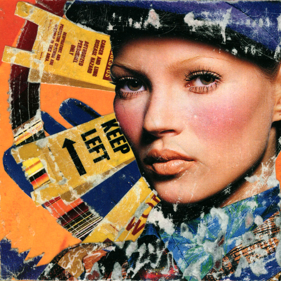
11-Kate01
©1992 Craig Ashby
Collage
3.75″ x 3.75″
Finally, the delicious Kate Moss makes her appearance. It’s the only one in the series of dearest Kate. Coincidentally it’s one of the best.
The color scheme of red, orange and blue and the destruction are perfect. Her face equally perfect. A blue suede glove as an angel wing. The folding plastic signs as rays of light. It’s all exactly what I wanted to say in the series.
It always starts off with a great image. Kate Moss in patchwork suit with paperboy cap is everything. Wish I could remember the designer.
I do remember that this image is from Harper’s Bazaar, after it’s relaunch and redesign in 1992. That first issue by Liz Tilberis with Linda Evangelista on the cover was amazing.
At the time I preferred it over Vogue for its concise visual style and direction. Those were great magazine reading years. I remember loving it in the same way I did oink.cd. It was a legendary moment.
A friend Rafe questioned me recently when I claimed to have no regrets while out for a drink at Tavern on Jane. I explained that I had a greater understanding of time and how fickle and quickly it moves. Blah, blah, blah.
The reality is this. I carried maybe five years of Vogue, Harper’s Bazaar and the old W to everyplace I moved. The W that came like a newspaper and had huge, gorgeous ads from the early nineties. The entire Liz Tilberis run at Harper’s Bazaar.
In a cleaning frenzy one day, I threw them all out. All of it. To this day I wish I had access to those magazines. Minor regret but regret nonetheless.
